As a newly launched real estate company, Urban Planet desired to break into Nigeria's saturated real estate market by providing exceptional services to their clients (especially middle-class and high-net-worth individuals).
I wanted to tell the company's story of becoming a go to source for quality homes/estates. However, in an exciting way that would build awareness and help Urban Planet stand out in the crowded real estate industry. I wanted the right perception to be shaped in their clients' minds.
I understood the company's needs perfectly. I needed to develop a logo & visual identity system that would consistently communicate the brand values and portray the right message to the public.
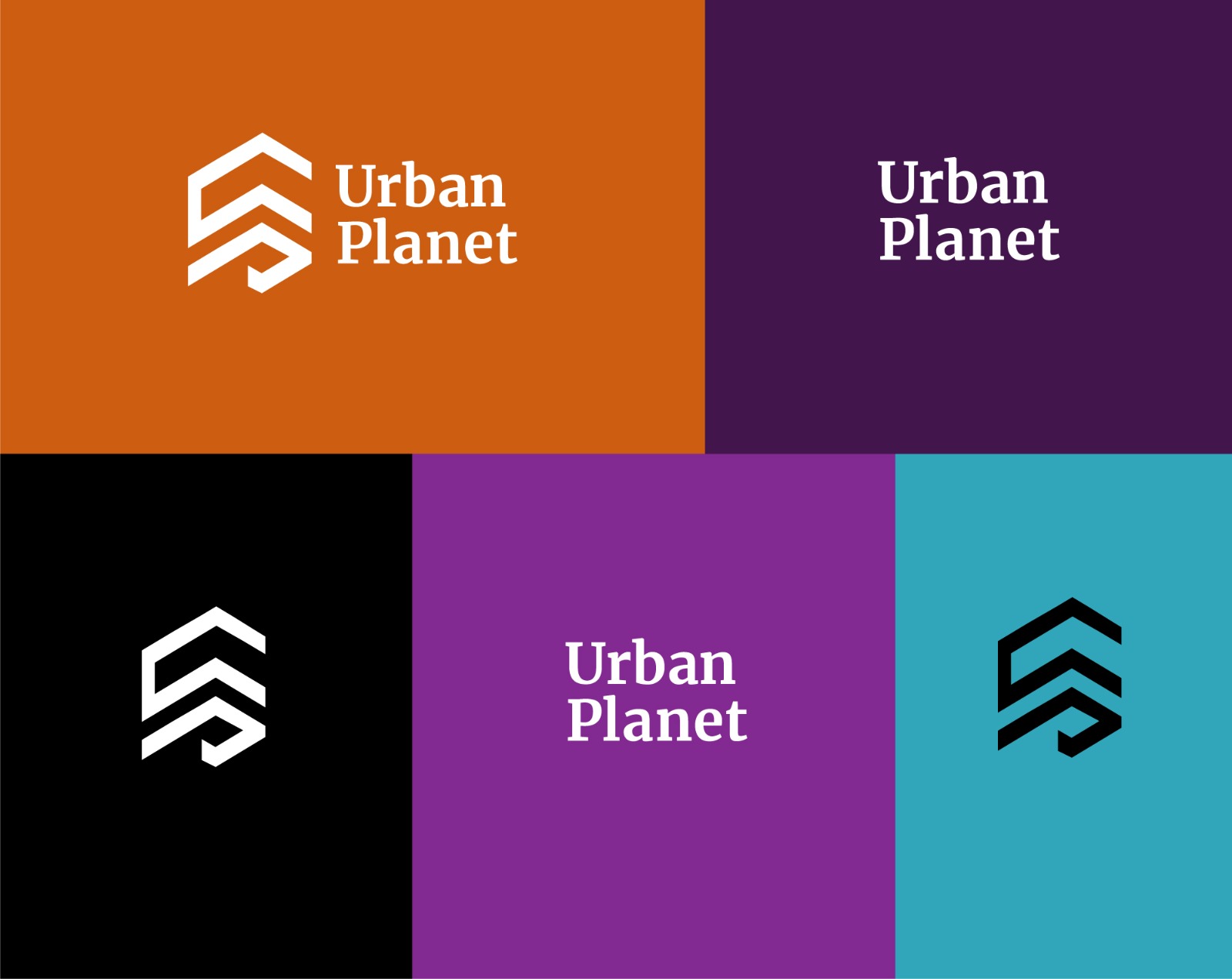
In my research, I found that a geometric representation of the letter U and P to form an icon symbolizing a constructed building would be great for this project.
The reasoning here is the letter U and P would stand for the brand's initial name, and the geometric lines of the icon would suggest reliability, luxury and development.
The icon is a key part of the identity system that is applied with other elements of the brand such as patterns and color
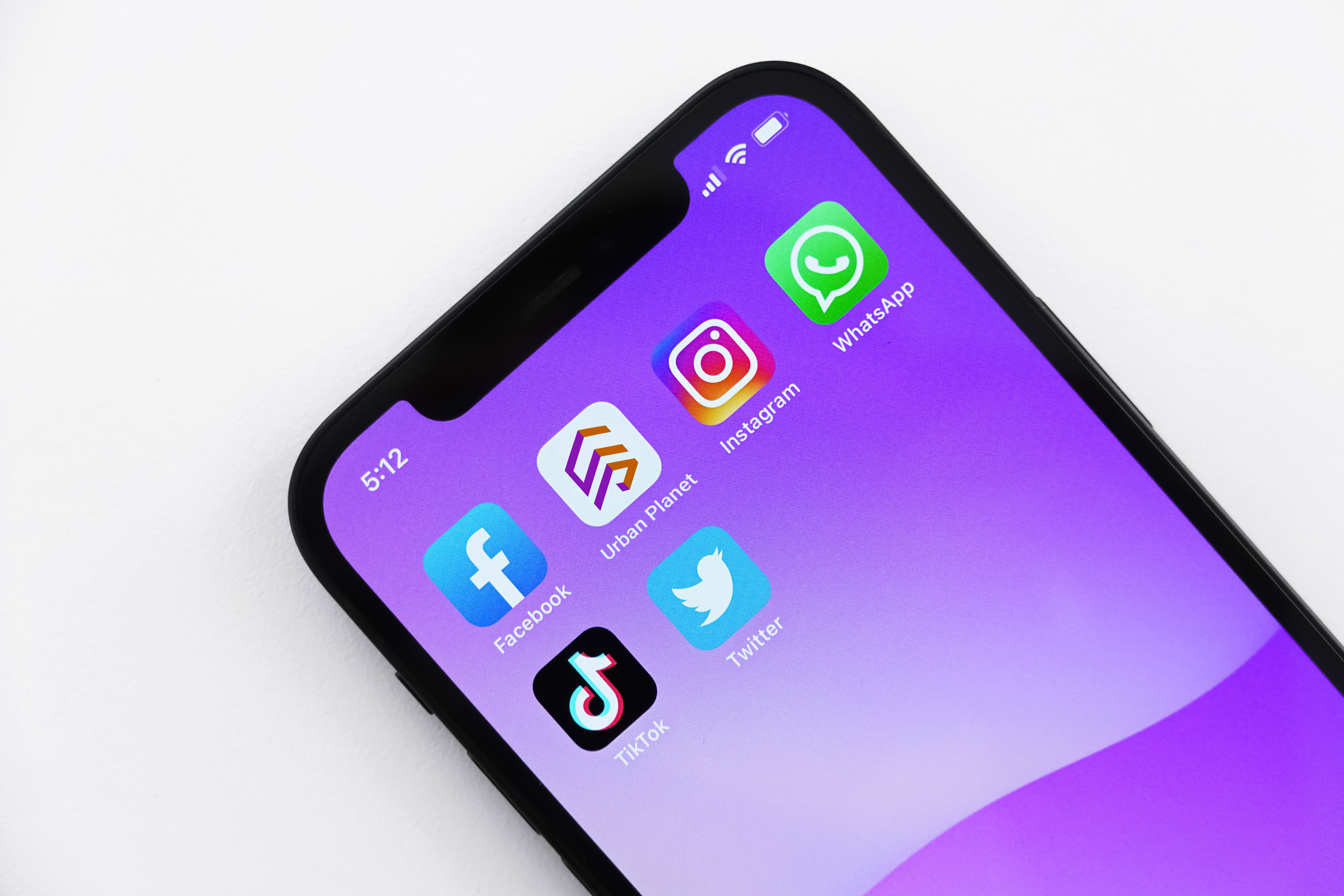
Amidst the fully saturated real estate industry in Nigeria, Urban Planet (a newly launched real estate company) is already beginning to gain traction with its new brand identity.
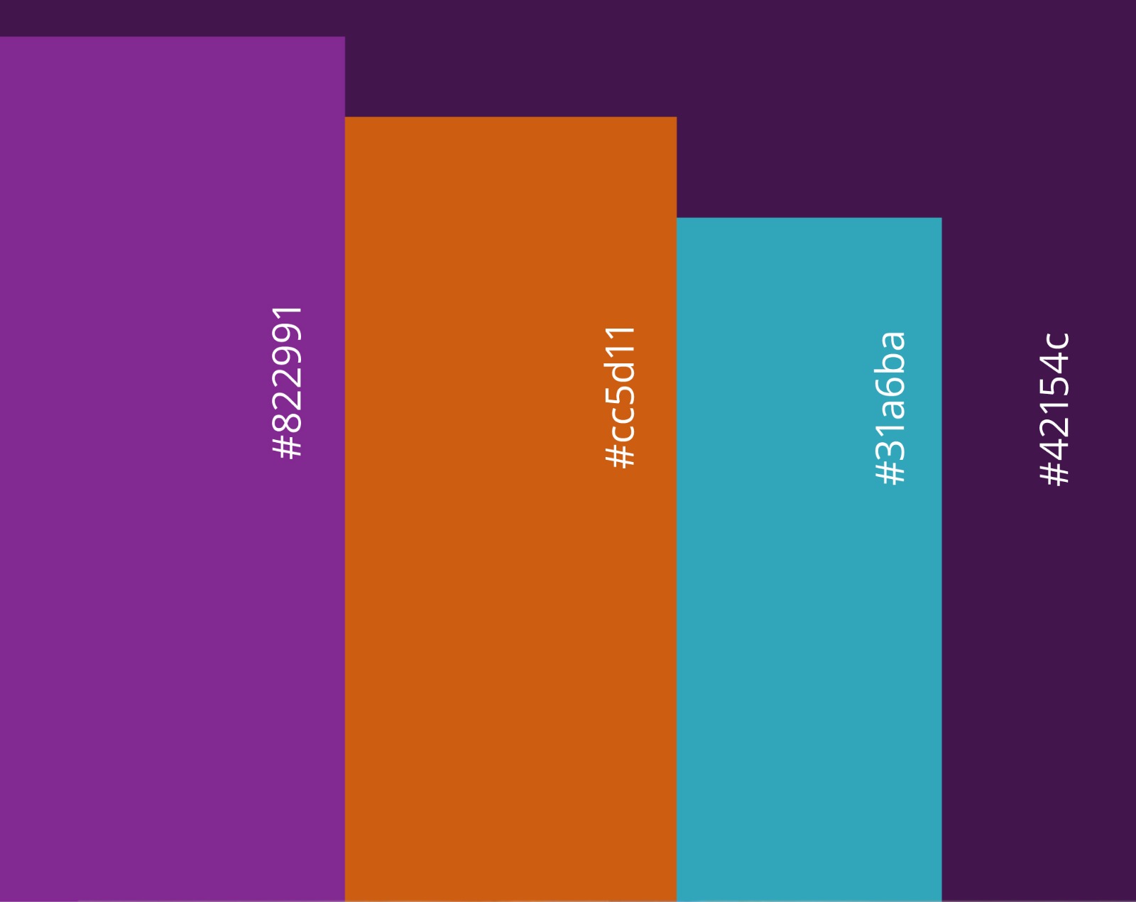
I understand colours are really essential when it comes to decision making. It helps improve recognizability and let clients interact better. My research behind colour psychology helped me use it to our advantage. A colour palette was developed to tell the brand's story in a way that appealed to the audience.