Blubur Airlines is an Irish commercial airline based in Dublin. Over 50 countries are served by this Irish airline, which is one of the country's major airlines. To capture Blubur's identity more intentionally, the company strives to expand and provide its passengers with the best experience possible.
Designing an identity for Blubur was no easy feat. I had to ensure the various approaches taken worked harmoniously across the extensive platforms the brand uses to showcase itself to its audience. A modern image was presented to work perfectly in the contemporary world of airline industries and give the brand a fresh look..

Blubur loves and places so much priority on the safety of its passengers. After gaining a better understanding of this, I began exploring. Looking for ways to translate this message into various aspects of the brand's identity.
While researching, I drew up a list of words that were strongly associated with the brand. These words served as a reminder of who Blubur is and ensured I never went off track.
Security
Style
Comfort
Change
Safe
Certainity
Smooth
Calm
In my brainstorming sessions, I considered several symbols that would convey the safety and positive travel experience. I experimented with several elements, marks and layouts.
After a few promising ideas, I began working on them digitally until I finally landed on this!
The final design symbol features two stylized B's at both sides, stands for Blu and Bur.
At the center is the negative space representing its passengers. The positive space of the stylized B's represents Blubur providing a safe flight for its users.
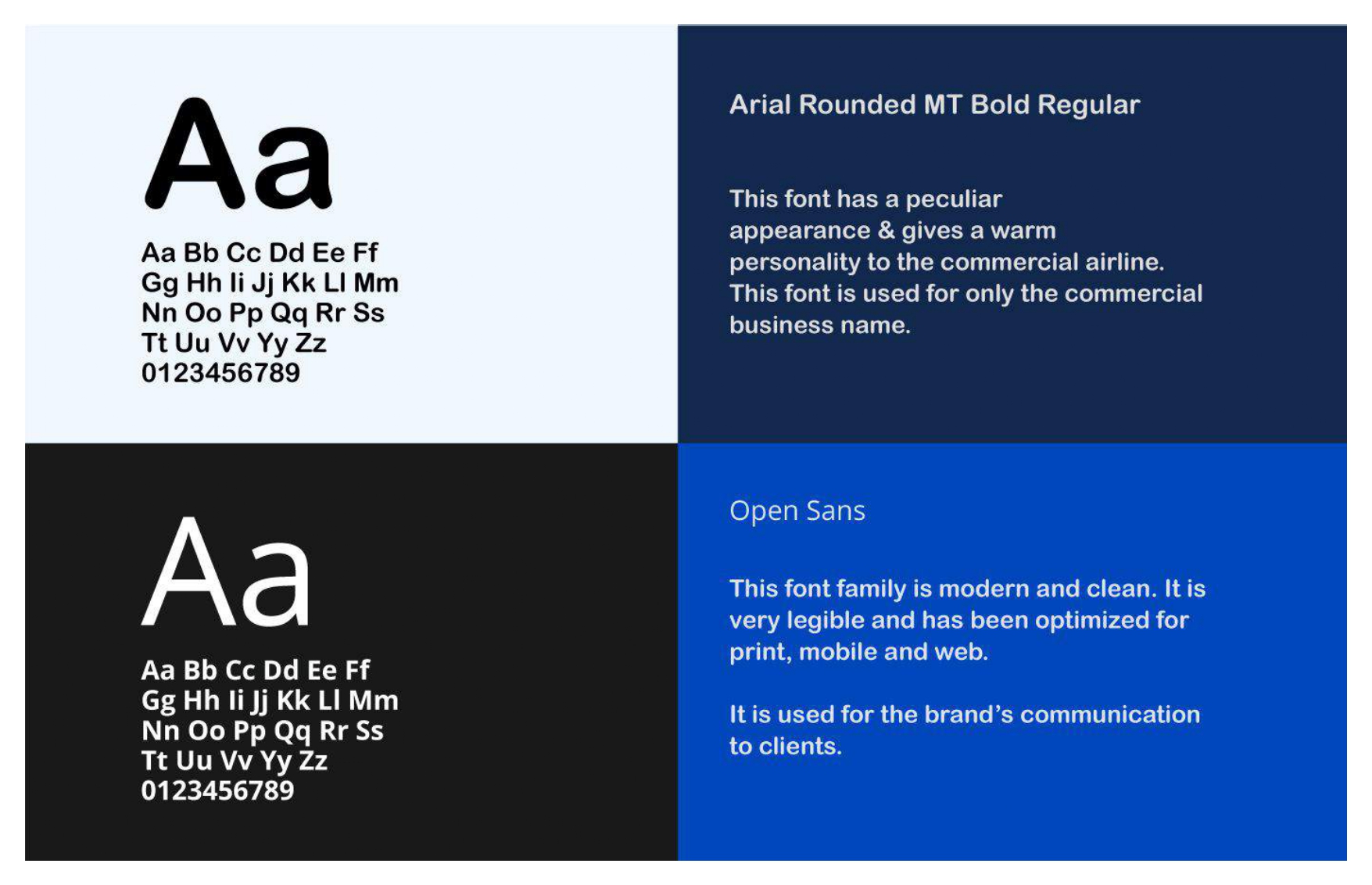
The typeface was rounded to give a warm and inviting personality.
To foster a strong recognition and bring more life and depth to the visual system, a brand pattern was developed using the logo.
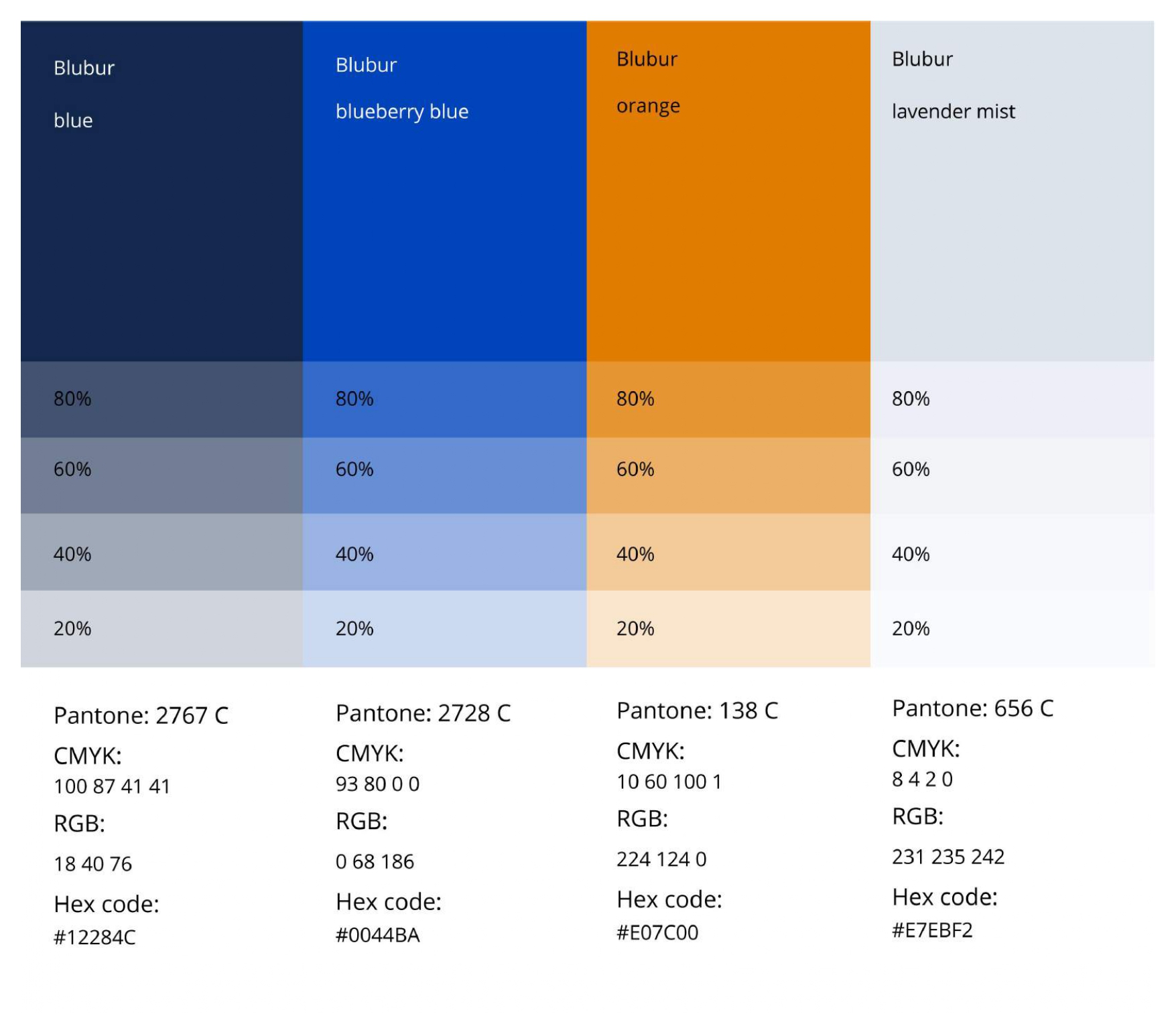
The official colour of the company is Blubur blue. Competence and warmth are reflected in the new identity's color palette.